在本章中,我们将展示使用Angular中的Highcharts API绘制图表所需的配置.
步骤1 - 创建角度应用程序
按照以下步骤更新我们在 Angular 6 - Project Setup 章节中创建的Angular应用程序;
| Step | 描述 |
|---|---|
| 1 | 使用名称创建项目 highchartsApp ,如 Angular 6 - Project Setup 章节中所述. |
| 2 | 修改 app.module.ts , app.component .ts 和 app.component.html ,如下所述.保持其余文件不变. |
| 3 | 编译并运行应用程序以验证实现逻辑的结果. |
以下是修改过的模块描述符的内容 app.module.ts .
import { BrowserModule } from '@angular/platform-browser';import { NgModule } from '@angular/core';import { AppComponent } from './app.component';import { HighchartsChartComponent } from 'highcharts-angular';@NgModule({ declarations: [ AppComponent, HighchartsChartComponent ], imports: [ BrowserModule, ], providers: [], bootstrap: [AppComponent]})export class AppModule { }以下是修改后的HTML主机文件的内容 app.component.html .
[Highcharts] = "highcharts" [options] = "chartOptions" style = "width: 100%; height: 400px; display: block;"
在理解配置后,我们会在最后看到更新后的app.component.ts.
第2步和第2步;使用配置
创建Highcharts并创建chartOptions
highcharts = Highcharts;chartOptions = { }创建图表
配置类型,标题和子使用chartOptions的图表的标题.
chart: { type: "spline"},xAxis
使用chartOptions配置要在X轴上显示的代码.
xAxis:{ categories:["Jan", "Feb", "Mar", "Apr", "May", "Jun", "Jul", "Aug", "Sep", "Oct", "Nov", "Dec"]},yAxis
使用chartOptions配置要在Y轴上显示的标题.
yAxis: { title:{ text:"Temperature °C" } },tooltip
配置工具提示.使用chartOptions将后缀添加到值(y轴)之后.
tooltip: { valueSuffix:" °C"},series
使用chartOptions配置要在图表上显示的数据. Series是一个数组,其中此数组的每个元素在图表上代表一行.
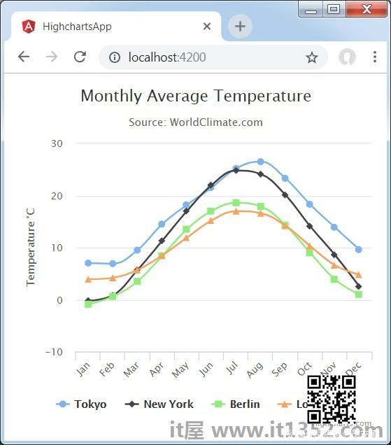
series: [ { name: 'Tokyo', data: [7.0, 6.9, 9.5, 14.5, 18.2, 21.5, 25.2,26.5, 23.3, 18.3, 13.9, 9.6] }, { name: 'New York', data: [-0.2, 0.8, 5.7, 11.3, 17.0, 22.0, 24.8,24.1, 20.1, 14.1, 8.6, 2.5] }, { name: 'Berlin', data: [-0.9, 0.6, 3.5, 8.4, 13.5, 17.0, 18.6, 17.9, 14.3, 9.0, 3.9, 1.0] }, { name: 'London', data: [3.9, 4.2, 5.7, 8.5, 11.9, 15.2, 17.0, 16.6, 14.2, 10.3, 6.6, 4.8] }]示例
请考虑以下示例以进一步了解配置语法 :
app.component.ts
import { Component } from '@angular/core';import * as Highcharts from 'highcharts';@Component({ selector: 'app-root', templateUrl: './app.component.html', styleUrls: ['./app.component.css']})export class AppComponent { highcharts = Highcharts; chartOptions = { chart: { type: "spline" }, title: { text: "Monthly Average Temperature" }, subtitle: { text: "Source: WorldClimate.com" }, xAxis:{ categories:["Jan", "Feb", "Mar", "Apr", "May", "Jun", "Jul", "Aug", "Sep", "Oct", "Nov", "Dec"] }, yAxis: { title:{ text:"Temperature °C" } }, tooltip: { valueSuffix:" °C" }, series: [ { name: 'Tokyo', data: [7.0, 6.9, 9.5, 14.5, 18.2, 21.5, 25.2,26.5, 23.3, 18.3, 13.9, 9.6] }, { name: 'New York', data: [-0.2, 0.8, 5.7, 11.3, 17.0, 22.0, 24.8,24.1, 20.1, 14.1, 8.6, 2.5] }, { name: 'Berlin', data: [-0.9, 0.6, 3.5, 8.4, 13.5, 17.0, 18.6, 17.9, 14.3, 9.0, 3.9, 1.0] }, { name: 'London', data: [3.9, 4.2, 5.7, 8.5, 11.9, 15.2, 17.0, 16.6, 14.2, 10.3, 6.6, 4.8] } ] };}结果
验证结果.