探索性数据分析是John Tuckey(1977)开发的一个概念,它包含了统计学的新视角. Tuckey的想法是,在传统的统计数据中,数据没有以图形方式进行探索,只是被用来检验假设.开发工具的第一次尝试是在斯坦福完成的,该项目被称为 prim9 .该工具能够以九维方式显示数据,因此能够提供数据的多变量视角.
最近几天,探索性数据分析是必须的,并已包含在大数据分析生命周期.能够在组织中找到洞察力并能够有效地进行沟通的能力得益于强大的EDA能力.
基于Tuckey的想法,贝尔实验室开发了 S编程语言
b>为了提供进行统计的交互式界面. S的想法是通过易于使用的语言提供广泛的图形功能.在当今世界,在大数据的背景下,基于 S 编程语言的 R 是最受欢迎的分析软件.
以下程序演示了探索性数据分析的使用.
以下是探索性数据分析的一个例子.此代码也可在 part1/eda/exploratory_data_analysis.R 文件中找到.
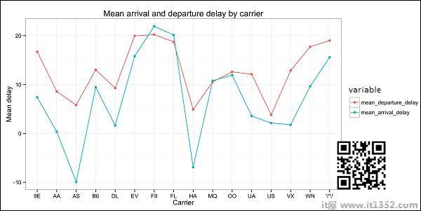
library(nycflights13) library(ggplot2) library(data.table) library(reshape2) # Using the code from the previous section # This computes the mean arrival and departure delays by carrier. DT <- as.data.table(flights) mean2 = DT[, list(mean_departure_delay = mean(dep_delay, na.rm = TRUE), mean_arrival_delay = mean(arr_delay, na.rm = TRUE)), by = carrier] # In order to plot data in R usign ggplot, it is normally needed to reshape the data # We want to have the data in long format for plotting with ggplot dt = melt(mean2, id.vars = ’carrier’) # Take a look at the first rows print(head(dt)) # Take a look at the help for ?geom_point and geom_line to find similar examples # Here we take the carrier code as the x axis # the value from the dt data.table goes in the y axis # The variable column represents the color p = ggplot(dt, aes(x = carrier, y = value, color = variable, group = variable)) + geom_point() + # Plots points geom_line() + # Plots lines theme_bw() + # Uses a white background labs(list(title = 'Mean arrival and departure delay by carrier', x = 'Carrier', y = 'Mean delay')) print(p) # Save the plot to disk ggsave('mean_delay_by_carrier.png', p, width = 10.4, height = 5.07)代码应生成如下图像 :