分析数据的第一种方法是对其进行可视化分析.这样做的目的通常是找到变量之间的关系和变量的单变量描述.我们可以将这些策略划分为 :
单变量分析
多变量分析
单变量图形方法
单变量是一个统计术语.实际上,这意味着我们希望独立于其余数据分析变量.允许有效执行此操作的图是 :
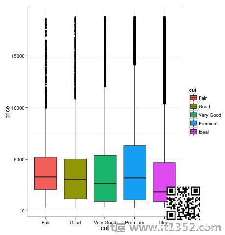
Box-Plots
Box-Plots通常用于比较分布.这是一种视觉检查分布之间是否存在差异的好方法.我们可以看到不同切割的钻石价格之间是否存在差异.
# We will be using the ggplot2 library for plottinglibrary(ggplot2) data("diamonds") # We will be using the diamonds dataset to analyze distributions of numeric variables head(diamonds) # carat cut color clarity depth table price x y z # 1 0.23 Ideal E SI2 61.5 55 326 3.95 3.98 2.43 # 2 0.21 Premium E SI1 59.8 61 326 3.89 3.84 2.31 # 3 0.23 Good E VS1 56.9 65 327 4.05 4.07 2.31 # 4 0.29 Premium I VS2 62.4 58 334 4.20 4.23 2.63 # 5 0.31 Good J SI2 63.3 58 335 4.34 4.35 2.75 # 6 0.24 Very Good J VVS2 62.8 57 336 3.94 3.96 2.48 ### Box-Plotsp = ggplot(diamonds, aes(x = cut, y = price, fill = cut)) + geom_box-plot() + theme_bw() print(p)我们可以在图中看到不同类型的切割中钻石价格的分布存在差异.
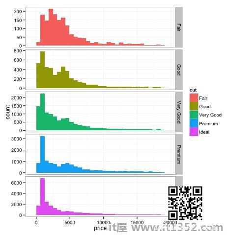
直方图
source('01_box_plots.R')# We can plot histograms for each level of the cut factor variable using facet_grid p = ggplot(diamonds, aes(x = price, fill = cut)) + geom_histogram() + facet_grid(cut ~ .) + theme_bw() p # the previous plot doesn’t allow to visuallize correctly the data because of the differences in scale # we can turn this off using the scales argument of facet_grid p = ggplot(diamonds, aes(x = price, fill = cut)) + geom_histogram() + facet_grid(cut ~ ., scales = 'free') + theme_bw() p png('02_histogram_diamonds_cut.png') print(p) dev.off()上述代码的输出如下 :
多变量图形方法
探索性数据分析中的多变量图形方法的目标是找到不同变量之间的关系.通常使用两种方法来实现这一点:绘制数值变量的相关矩阵或简单地将原始数据绘制为散点图矩阵.
为了证明这一点,我们将使用钻石数据集.要按照代码,打开脚本 bda/part2/charts/03_multivariate_analysis.R .
library(ggplot2)data(diamonds) # Correlation matrix plots keep_vars = c('carat', 'depth', 'price', 'table') df = diamonds[, keep_vars] # compute the correlation matrix M_cor = cor(df) # carat depth price table # carat 1.00000000 0.02822431 0.9215913 0.1816175 # depth 0.02822431 1.00000000 -0.0106474 -0.2957785 # price 0.92159130 -0.01064740 1.0000000 0.1271339 # table 0.18161755 -0.29577852 0.1271339 1.0000000 # plots heat-map(M_cor)
代码将产生以下输出 :
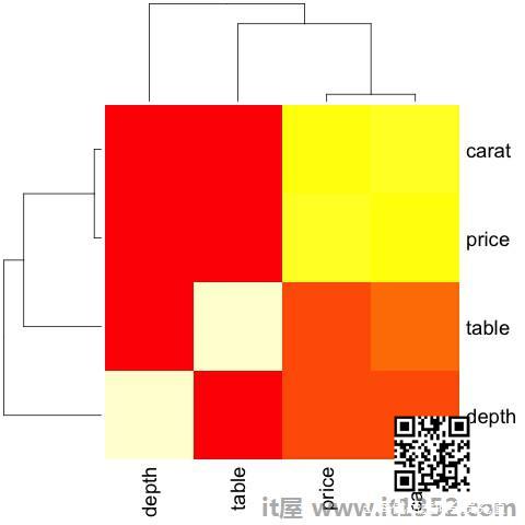
这是一个总结,它告诉我们价格与插入符号之间存在很强的相关性,而且不是很多其他变量.
当我们有大量变量时,相关矩阵可能很有用,在这种情况下绘制原始数据是不切实际的.如上所述,也可以显示原始数据 :
library(GGally)ggpairs(df)
我们可以在图中看到热图中显示的结果已经确认,价格和克拉变量之间存在0.922的相关性.
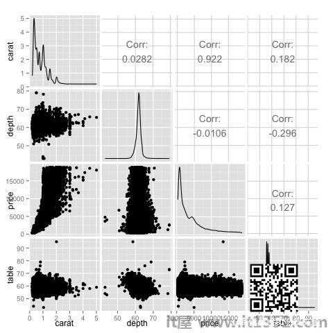
可以在位于该位置的price-carat散点图中可视化此关系(3,1)散点图矩阵的索引.